Category: Project

  • Data Privacy Campaign

    Data privacy is a rights issue.
    Policy needs to catch up.

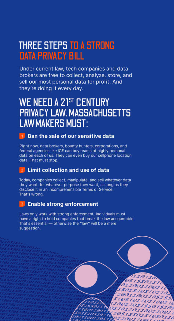
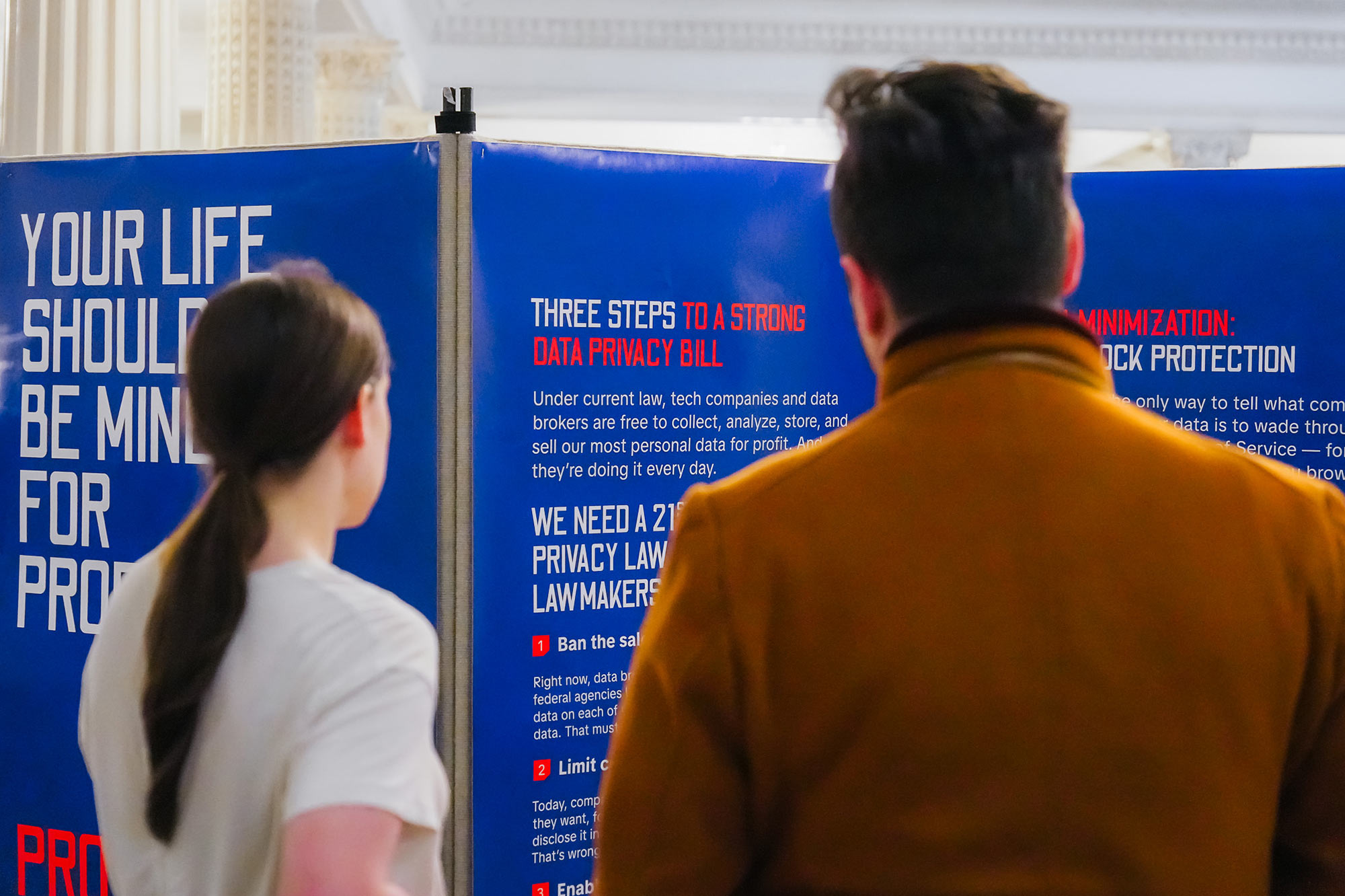
    The gap between what technology enables companies to do with our data and what the law protects us from is widening. For lawmakers and their staff, the issue is complex and technical, yet the stakes are concrete, affecting everything from personal safety to access to care.

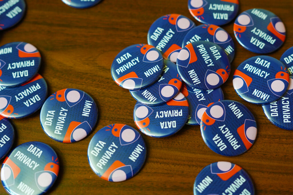
    Working with the ACLU of Massachusetts, I developed a large-scale 20-panel installation inside the Massachusetts State House to make the issue legible, translating data privacy into something immediate, physical, and difficult to ignore.

    The installation anchored a broader week of action across social and digital channels. The work created a shared point of understanding at a critical moment as the bill moved from the Senate to the House, extending significantly beyond the existing audience, with over 70% of impressions from non-followers, and equipping the Massachusetts legislature with a clearer understanding of what was at stake—and why it mattered.

  • Public Health on the Brink

    Public health was under attack.
    The response needed to be louder.

    Two years into the COVID-19 pandemic, the system meant to protect public health was buckling. Hundreds of leaders had resigned. State legislatures were stripping authority from local health departments. Disinformation was spreading faster than the virus itself.

    Public Health on the Brink was conceived as an integrated digital program spanning livestream events, editorial content, and social distribution.

    I developed the program’s microbrand and visual system, creating a distinct identity, and shaped how the series was expressed—translating a complex public health landscape into a cohesive, recognizable, and urgent call for support.

    A platform for difficult conversations.

    Public Health on the Brink convened an unusually wide coalition of voices—from five former CDC directors to local health officials working on the front lines of the pandemic. Through livestream panels, documentary-style interviews, and conversations with members of Congress, the series explored how the public health system could rebuild after the crisis.

    The project wasn’t designed as a typical academic program. It was built as a public forum, one capable of holding urgency, disagreement, and real solutions.

    Ideas that traveled.

    The project received an Anthem Award, recognizing its contribution to public health awareness and civic dialogue. More importantly, it made the stakes impossible to ignore.

    • Featured in dozens of outlets, including Bloomberg, POLITICO, NBC News, and Vanity Fair
    • 15,000+ views across panel discussions
    • 4,300+ views across Congressional interviews
    • 25-minute average watch time, the longest engagement of any Harvard Chan Studio series
    • Hundreds of audience questions per event, signaling deep engagement
  • Gallery 263 Rebrand

    The gallery’s community had grown.
    The brand needed to meet it there.

    After 15 years of steady growth, the organization had become one of the most respected nonprofit art spaces in Greater Boston. Its identity, however, still reflected its scrappier beginnings. The previous mark was literal and constrained. The brand did not fully communicate its nonprofit status, credibility within the arts, or its role as a cultural anchor in Cambridge.

    As former board president and a long-time board member, I led the rebrand from the inside. I defined the strategic positioning, created the new visual identity, and designed and developed the website. The goal was not just a refreshed look, but a clearer articulation of what the gallery had become.

    Multiple perspectives

    The new identity centers on a confident, asymmetrical “263” mark, designed by Izzy Walter, and abstracted as a three-dimensional shape. It’s flexible, expressive, and built to hold a wide range of artistic voices who come to the gallery from from all walks of life.

    Dropping the literal framing of the previous logo allowed the number itself to become the brand, rooted in place but open in interpretation and championing multiple perspectives—a wide-ranging color pallete allowed the identity to be expansive and reflect this idea.

    Room to grow, and grow some more.

    We shifted to a streamlined, image-forward dot-org experience to emphasize the gallery’s nonprofit status and foregrounded the work of artists and the community. The system was designed for longevity and adaptability, giving the organization room to grow while staying grounded in its ethos: a space where anyone is welcome from any perspective to share, create, and feel the wonder of art. This was not a cosmetic refresh. It was an institutional acknowledgment of maturity and a platform for the next chapter.

  • Harvard T.H. Chan School of Public Health Rebrand

    Harvard Chan School didn’t need a new color palette. It needed to feel like itself.

    The school is home to people working on the biggest health challenges in the world, but the brand experience was cold, fragmented, and overly institutional. Nearly 200 subsites. A broken prospective student flow. Departments and offices operating in silos. The heart of the place was buried under its own structure.

    As the school’s creative director, I co-led the vision and guided the agency partnership to shift the center of gravity from hierarchy to humanity. We aligned leadership around a community-first narrative, then built the strategy and system to support it through workshops across the school and a rethinking of user journeys for prospective students exploring complex public health degrees.

    The system created a more consistent and scalable foundation for communications, improving clarity across digital touchpoints and enabling teams to produce work more efficiently.

    A visual motif tying it all together.

    The public health halo became more than a design device. It became a connective idea, showing how knowledge moves outward from campus to global impact.

    My role was ensuring that concept was not just aesthetically compelling, but institutionally usable and scalable across a multifaceted design ecosystem.

    Motion graphics

    The power of a brand.

    The results were measurable, a 23% increase in application conversions, a 19% lift in engaged visits, and a Webby Award.

    More importantly, the brand finally matched the culture, prestigious, yes, but grounded in care and community. Our community felt proud and energized by the new look.

    Exterior signage
    Interior refreshes
    Interior refreshes

    After launch, the real work began.

    I led brand activation across the school, working with my team, colleagues, and vendors to rebuild templates, reshape social and video assets, and extend the system into physical space, including commencement, experiential graphics, and campus upgrades.

    The brand needed to be understood and accurately applied by many internal parties. The goal was cohesion—if you visited the campus, scrolled Instagram, or applied to a degree program, it felt like one school, warm, rigorous, and deeply human.

    Experiential refreshes
    Display ads
    Display ads
    Newsletter templates