Harvard Chan School didn’t need a new color palette. It needed to feel like itself.
The school is home to people working on the biggest health challenges in the world, but the brand experience was cold, fragmented, and overly institutional. Nearly 200 subsites. A broken prospective student flow. Departments and offices operating in silos. The heart of the place was buried under its own structure.
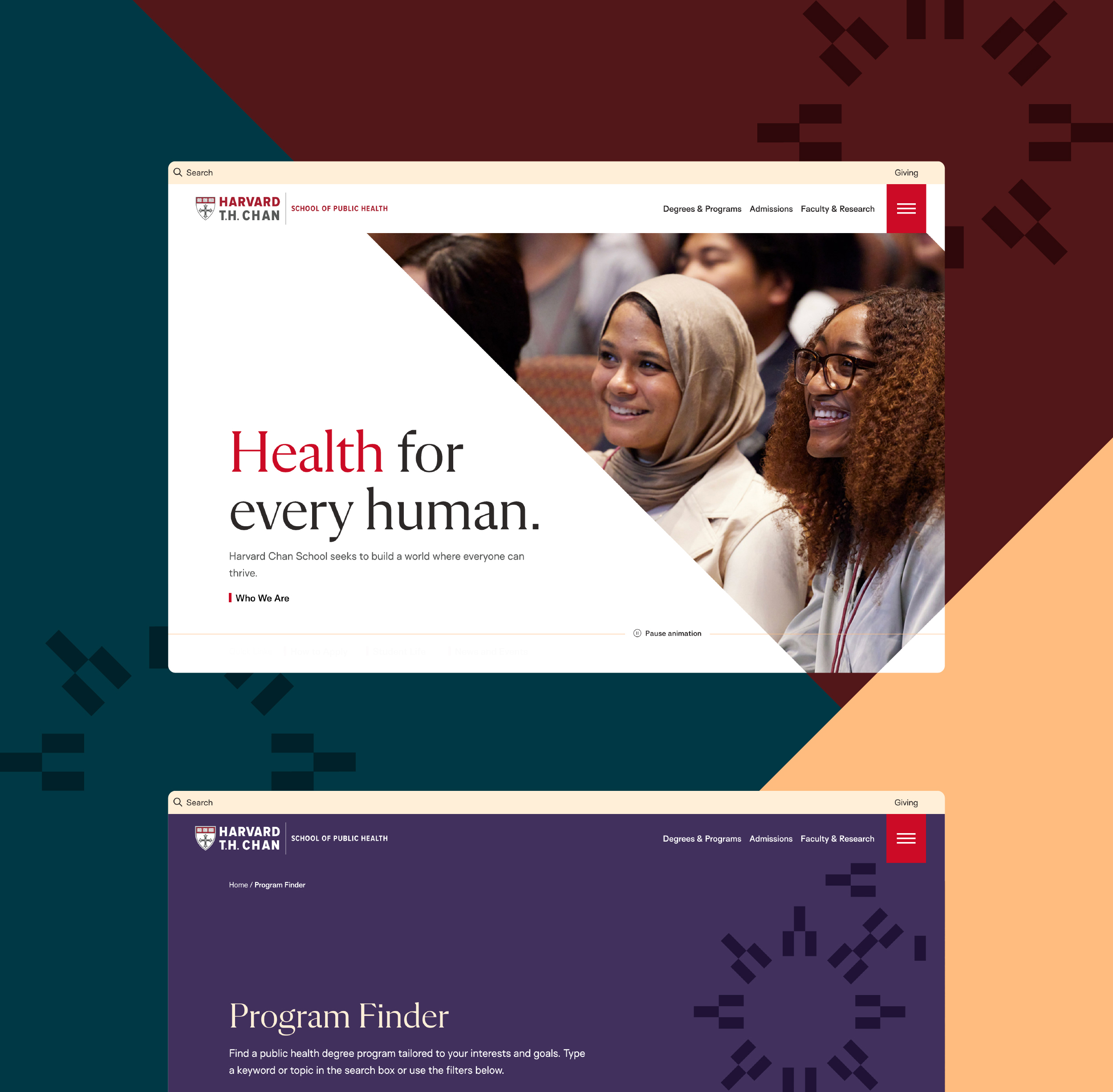
As the school’s creative director, I co-led the vision and guided the agency partnership to shift the center of gravity from hierarchy to humanity. We aligned leadership around a community-first narrative, then built the strategy and system to support it through workshops across the school and a rethinking of user journeys for prospective students exploring complex public health degrees.
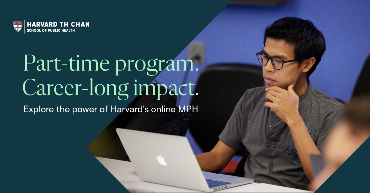
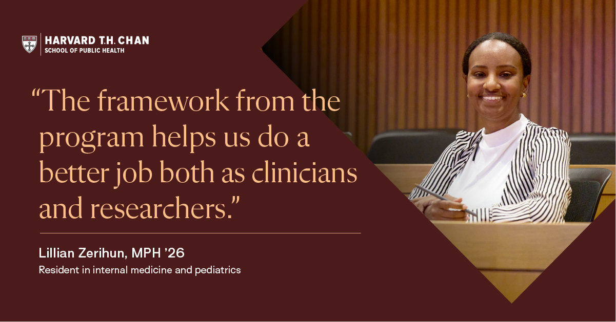
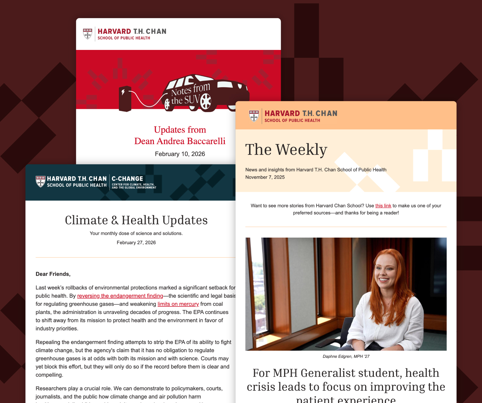
The system created a more consistent and scalable foundation for communications, improving clarity across digital touchpoints and enabling teams to produce work more efficiently.

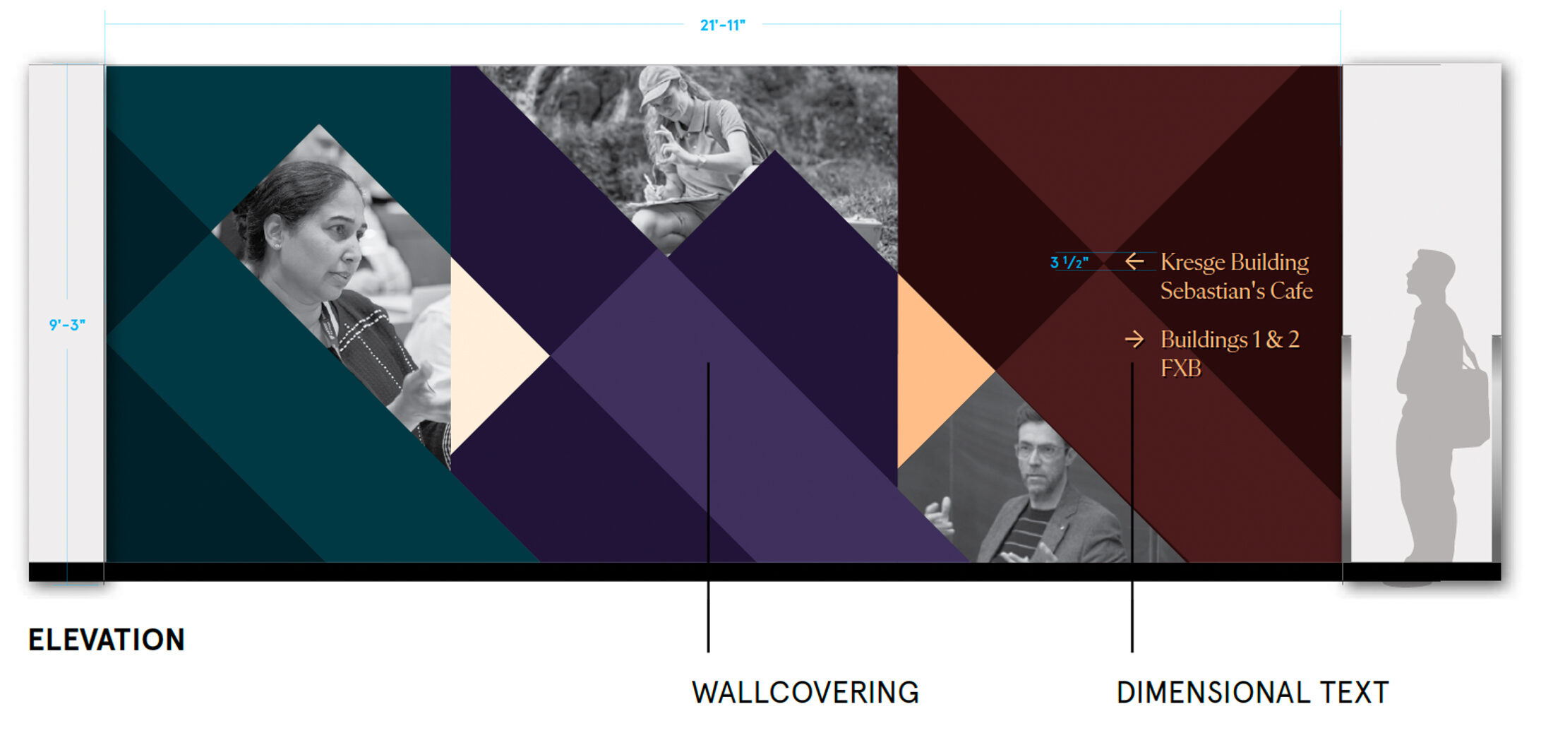
A visual motif tying it all together.
The public health halo became more than a design device. It became a connective idea, showing how knowledge moves outward from campus to global impact.
My role was ensuring that concept was not just aesthetically compelling, but institutionally usable and scalable across a multifaceted design ecosystem.

The power of a brand.
The results were measurable, a 23% increase in application conversions, a 19% lift in engaged visits, and a Webby Award.
More importantly, the brand finally matched the culture, prestigious, yes, but grounded in care and community. Our community felt proud and energized by the new look.
After launch, the real work began.
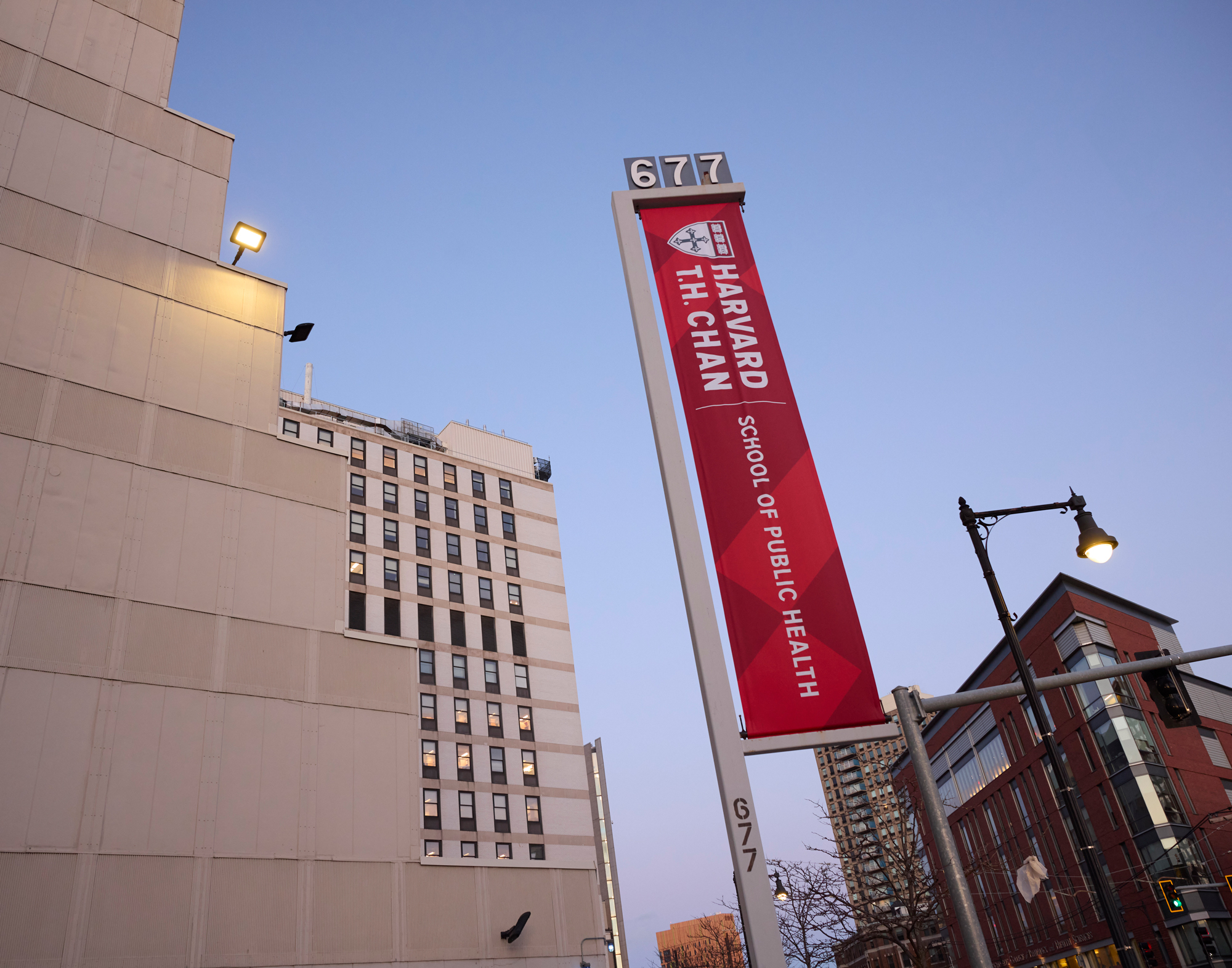
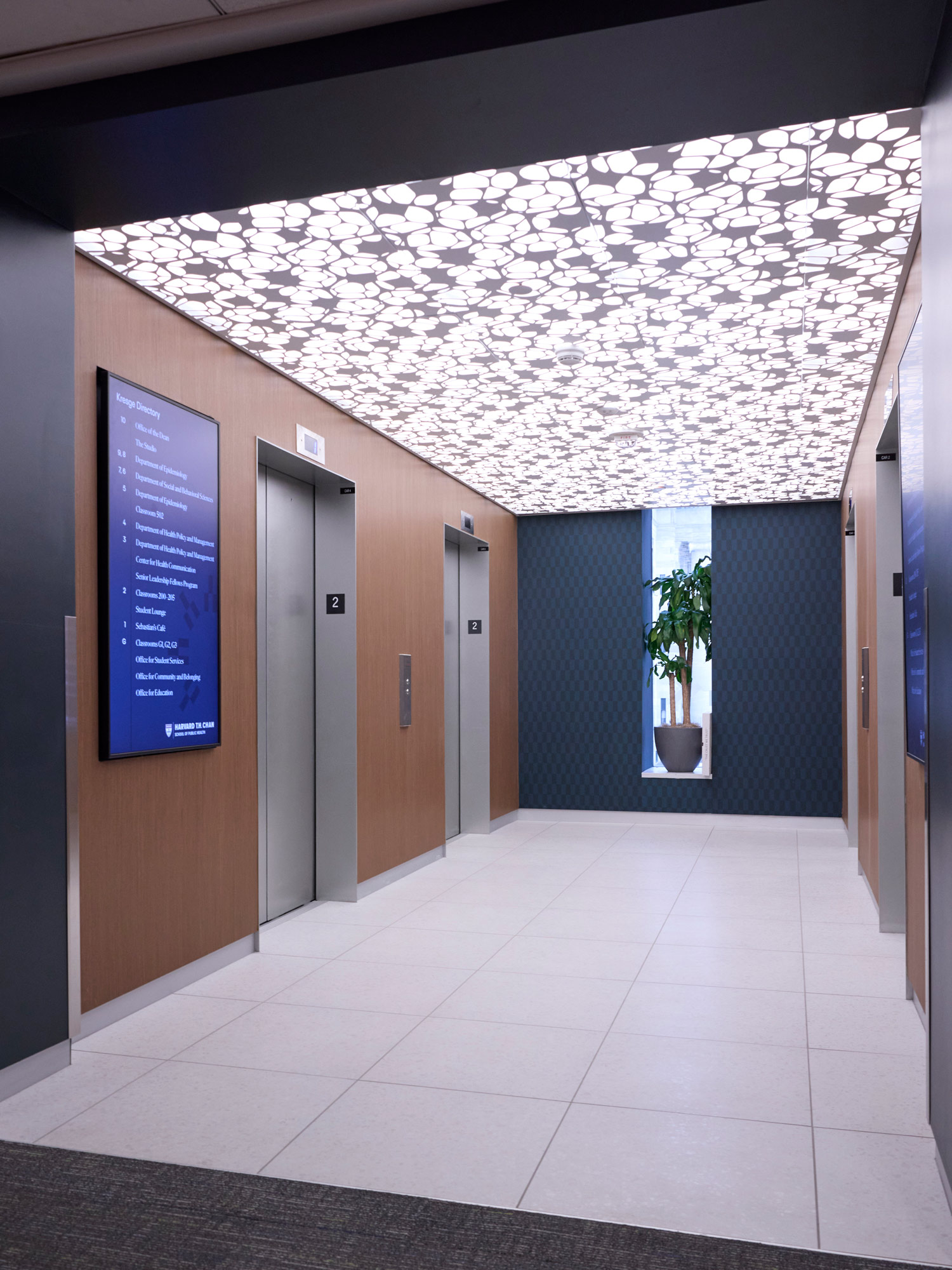
I led brand activation across the school, working with my team, colleagues, and vendors to rebuild templates, reshape social and video assets, and extend the system into physical space, including commencement, experiential graphics, and campus upgrades.
The brand needed to be understood and accurately applied by many internal parties. The goal was cohesion—if you visited the campus, scrolled Instagram, or applied to a degree program, it felt like one school, warm, rigorous, and deeply human.